PROJECT DURATION APRIL TO JUNE 2023
PROJECT DURATION APRIL TO JUNE 2023
MY ROLE
UX designer leading the app and responsive website design from conception to delivery.
RESPONSABILITIES
Conducting interviews, paper and digital wireframing, low and high-fidelity prototyping, conducting usability studies, accounting for accessibility, iterating on designs, determining information architecture, and responsive design.
THE PROBLEM
In Argentina, 40% of the population is poor, affecting mostly children. The strategy team at GiveHub has identified that most people are willing to help people in need, but face challenges in the donation process.
THE GOAL
Design an app that will make the process of donating goods to people in need, easy and effective.

I conducted interviews and created empathy maps to understand the users I’m designing for and their needs. A primary user group identified through research was busy parents who have goods they no longer need and want to give them to people in need in their local community.
“I want to inspire my children by making a meaningful impact in all areas of my life.”
AGE 41 | EDUCATION Bachelors’ Degree
Hometown Córdoba, Argentina | Family: Married, 3 kids
GOALS
• Find a balance between her professional life and her responsibilities as a mother.
• Donate clothes, toys and other items that her kids don’t use anymore.
• Identify acceptable places to donate items.
FRUSTRATIONS
• Can't find acceptable places to donate items near her home.
• Items waiting to be donated take up valuable space in her home.
• TFinding time to sort through and donate items she and her family no longer need.
Emilia is a highly driven and accomplished marketing manager in a reputable company. She works diligently while actively striving to strike a balance between her demanding career and her fulfilling role as a mother. Emilia takes on professional challenges while being fully present for her family.
She is actively involved in her children's lives, attending school events, extracurricular activities, and dedicating her time to helping them with their homework.
She understands the value of decluttering for a more organized and meaningful living space while making a positive impact on others through her donations.
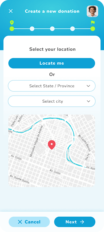
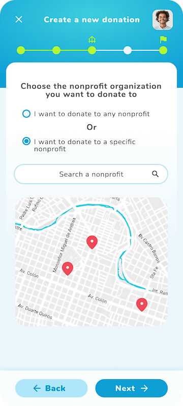
I did a quick ideation exercise to come up with ideas for how to address gaps identified in the competitive audit. My focus was specifically on finding donation spots and the simplification of the donation process.
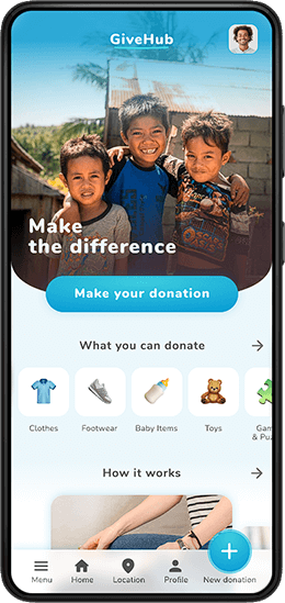
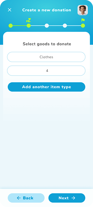
After ideating and drafting some paper wireframes, I created the initial designs for the app. These designs focused on the process of creating a new donation.
The low-fidelity prototype shows the primary user flow of creating a new donation, so it could be used in a usability study with users.
Create a new donation button in a visible position
Icons of goods that can be donated
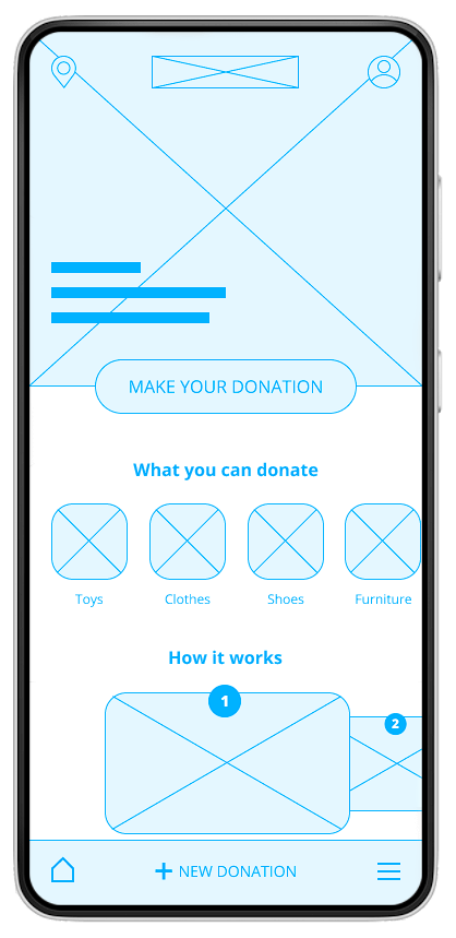
New donation progress bar
Navigation buttons
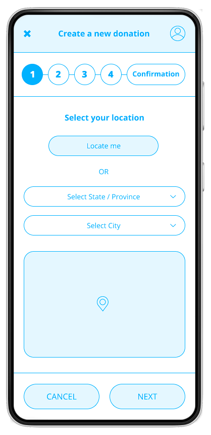
✔ The create donation process has too many steps.
✔ Users want more information about the nonprofit organizations.
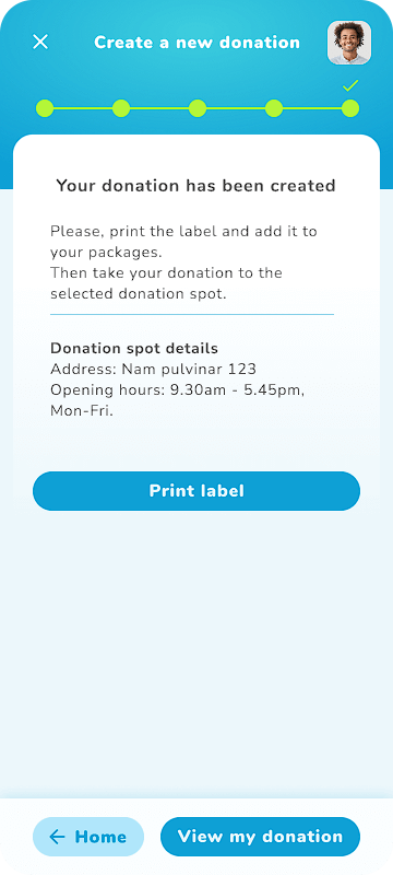
✔ Users want to know when their donations reach the organizations.
After the usability study, I made changes to the donation process. The steps were simplified so that the process wasn’t too long.


All color contrasts were checked, to ensure an accessible contrast ratio.
Alt text for images and labels for interactive elements that can be read by screen readers.
Used icons to help make navigation easier.
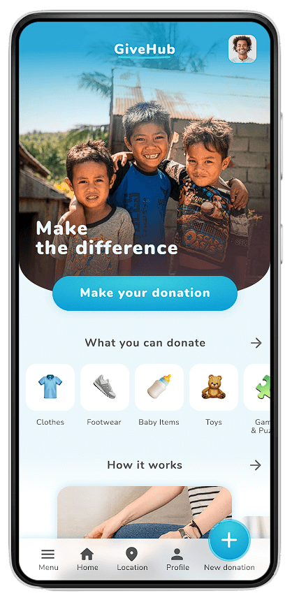
The app accomplishes the goal of offering a solution for the users, with a clear user flow and useful features.
One quote from user feedback: “It looks very simple and it is easy to understand.”
Conduct another round of usability studies to validate whether the pain points users experienced have been effectively addressed.
Keep working on the other functionalities and sections of the app.